Hattie Stewart @ No Walls Gallery: Pattern, Shape, Fluidity, Versions
Before I start this post it should be noted why I wanted to start this blog. It was not to attack any art or gallery, but to promote the visual arts in Brighton while treating exhibitions and galleries with the same level of critical analysis they expect in any other major artistic city. The lack of critical analysis and coverage for the art world in Brighton frustrated me and thought I would lend my hand as an art critic and reviewer to comment on the art in Brighton.
I have an interest in and love for Brighton, and treat each of my criticisms with care.


Anyway, to the review:
This is not the first time I have seen the London-based illustrator Hattie Stewart. I was lucky enough to view her exhibition last year, which was a series of pieces that bastardised the front of magazines. It was beautifully executed and displayed some great satire that was both insightful and entertaining.
What a difference a year makes.
In the words of No Walls Gallery:
“Since her debut solo show with us back in 2014, Hattie has fast become one of the most sought-after illustrators on the planet, having worked with the likes of Kylie Minogue, the Oscars, Pepsi Max, MTV, Lovebox and Poppy Lissiman...”
Meanwhile, she has apparently forgotten to take care in her work; this exhibition was absolutely unacceptable, and by far the worst exhibition I have seen in Brighton in four years of frequenting them in this wonderful city. At best, it’s a misjudgement on behalf of the artist and gallery; at worst it’s a cynical attempt to put in as little effort as possible and pull the wool over the eyes of collectors and visitors.
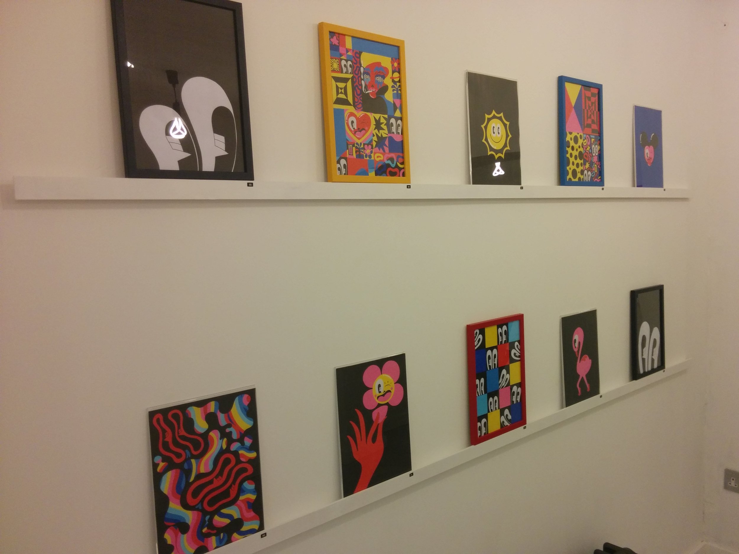
“Pattern, Shape, Fluidity, Versions” is a new series of 100 illustrations created using posca pens which, for the uninitiated among you, is essentially a felt tip. If you don’t believe me please feel free to check them out here. It is a poor choice of materials for her style, a very unforgiving material and difficult to create a line without leaving distinctive marks around the edge of each stroke, which shows up particularly badly in block colours. Though it is a personal stylistic choice, it seems an odd choice of material for doodles constructed with block colours and usually finished using digital technology with the aim of creating flawless pieces.
The very first piece in the exhibition (unimaginatively labelled “1”) had a hole in the paper where she had pressed too hard. She had then attempted to hide this mistake by re-gluing the paper on. From then on we were taken through drawing after drawing of a character with big eyes appearing in different colourful backgrounds. No progression, no narrative, no “themes” (despite what was hinted in the exhibition’s blurb), just piece after piece of repetitive, if quite fun, stale doodles.
The exhibition is also laden with errors and basic oversights. Each of the frames is different and sit randomly throughout the gallery with no rhyme or reason for the aesthetic. There are scuff marks, dirty frames and damaged pieces throughout the exhibition. Within the pieces themselves the theme continues; there were finger prints and you could still see the pencilled outlines coming through a few where she had changed her mind. In another exhibition, which focused on a kind of “anti” illustration in which mistakes are intentional these would be appropriate. Unfortunately these didn’t look like intentional flaws, but mistakes due to carelessness. The fact she exhibited the imperfect pieces is even more of a kick in the teeth.
Finally we have the real reason behind me writing this piece: the price. For a poorly-planned piece riddled with mistakes and questionable intentions by a “big name”, it cost £200. For £200, I want to know the person who created it actually cared about what they were creating rather than just throwing something down on a piece of paper. When viewed online the pieces look dramatically better than the originals, which is misleading for collectors and buyers.
This whole exhibition stinks of an artist who has got big, is used to churning pieces out and thinks she can get away with it. What’s worse is this is the first time that No Walls Gallery has put on an exhibition since the 31st May and it’s supposed to be a triumphant return to the visual art scene in Brighton. It is insulting to all involved, collectors and visitors alike, and Brighton deserves better.